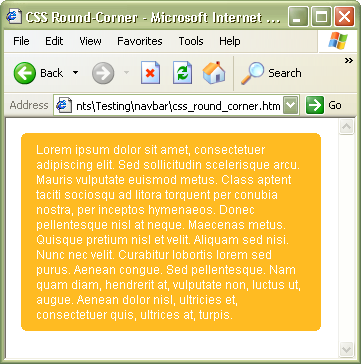
Another way to create CSS rounded corners without images. When using -moz-border-radius is not an option, this is a quick and easy solution that works with IE 6+ .
A quick way to create round-corners without using any images
Use an inline element such as <b> that acts like pixels.
The reasons for using <b> tags:
because it doesn't have semantical meaning, and can be nested in any tags.
CSS:
.box {
  background: #fb2;
  color: #fff;
}
.box p {margin: 5px 15px;}
.rTop, .rBottom {
  display:block;
  background:#fff;
}
.r1, .r2, .r3 {
  display: block;
  height: 1px;
  overflow: hidden;
  background:#fb2;
}
.r1 {margin: 0 4px}
.r2 {margin: 0 2px}
.r3 {margin: 0 1px; height: 2px}
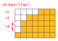
"Magnified view" of the rows (r1 thru r3) that act as pixels. For larger corner radius, increase the numbers of the rows and modify the margins and height on each row.
HTML:
<div class="box">
  <b class="rTop">
    <b class="r1"></b> <b class="r2"></b> <b class="r3"></b>
  </b>
    <p>content here</p>
  <b class="rBottom">
    <b class="r3"></b> <b class="r2"></b> <b class="r1"></b>
  </b>
</div>


No comments:
Post a Comment