Showing posts with label css. Show all posts

Sunday, April 29, 2007

So You Want to Build Mobile Website - 1. Markup

Maybe I should write something I know about mobile web (wap) developement sometimes since the demand is getting bigger here in the US.

First, you may wonder what markup you should use. Your choice may depend on where you are, or where your target viewers are. For majority of people/regions, main choice is probably XHTML, but there're still plenty of people in the world use devices support only WML. (I'm taking to you, Google!). If you are creating wap site for those cute Japanese phones, you may want to write in CHTML. If you are in India, your best choice would be WML.

Here's a list of markups and DTDs (if required):

XHTML Basic

XML-based markup typically for handheld devices

<!DOCTYPE html PUBLIC "-//W3C//DTD XHTML Basic 1.0//EN"
"http://www.w3.org/TR/xhtml-basic/xhtml-basic10.dtd">

XHTML-MP

XHTML Mobile Profile. This is a variant of XHTML Basic, defined by Open Mobile Alliance. This is usually my choice. Yes, it supports CSS!

<!DOCTYPE html PUBLIC "-//WAPFORUM//DTD XHTML Mobile 1.1//EN"
"http://www.wapforum.org/DTD/xhtml-mobile11.dtd">

WML

Wireless Markup Language. This is going to be phased out but majority of devices in India supports only WML. This is similar to HTML but there're lots of special tags not included in HTML. There're some features missing in XHTML, such as softkey configuration that I wish included in XHTML-MP.

<!DOCTYPE wml PUBLIC "-//PHONE.COM//DTD WML 1.1//EN"
"http://www.phone.com/dtd/wml11.dtd">

HDML

Handheld Device Markup Language, defined by Openwave. Some Japanese phones use this, and if I am not wrong, I think some Motorola (US) phones too.

CHTML

Compact HTML -similar to WML and HDML. Used only, yet big in Japan, and it works on Japan's DoCoMo's i-mode phones. More Japanese manifacturers started making devices that support XHTML so this will be pased out sooner or later.

MML

Mobile Markup Language. Another Japan-only markup and defined by J-Phone (now SoftBank Mobile) and Keio University. Who uses it anyway?


You must have notice there're too many (yes, I'd say too many) Japanese variants, but it looks like Japanese phone companies have started following global-standard way and more devices will support XHTML and replace the older devices soon.

Conclusion: Although I mentioned earlier that Google doesn't care about Indian users by not supporting WML, for majority of people, if you want to pick only one, I'd say you should write in XHTML.

I will write about more in details later.

Friday, October 06, 2006

Rounded Corner with Images - Create a Nav Bar

This is another example of round-corner in CSS, but this one requires images. The figure 1 is a screenshot of the actual horizontal nav bar I created a while ago.

screenshot
Figure 1.

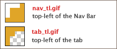
For this nav bar, I created 4 images - Top-left and top-right for the nav bar, and top-left and top-right corner for tabs. All images are created in 4 pixel by 4 pixel dimension. The figure 2 show the top-left of nav bar, and top-left of tabs.

gif examples
Figure 2.

The nav_tl.gif (nav) has orange round corners, while tab_tl.gif (tab) has orange background with transparent corners, because I wanted to create a "selected" tab and mouse-over color-change effect only with CSS color change, without using extra images.

The code below is the HTML part of the nav bar. I assign the background-image to <a> tag for top-left corner gif, and I gave nonsense tag, <span> to apply the top-right corner gif as background image.


HTML (Navbar using unordered lists)
<div id="navBar">
 <ul>
  <li><a href="#" class="selected"><span>Home</span></a></li>
  <li><a href="#"><span>Blog</span></a></li>
  <li><a href="#"><span>Extras</span></a></li>
 </ul>
</div>

Tabs with Round-Corners
/* Top-left corner */
#navBar a { 
 background: url("images/tab_tl.gif") no-repeat top left;  
}
/* Top-right corner */
#navBar a span { 
 background: url("images/tab_tr.gif") right top no-repeat;
}
/* Hover-state ("Blog" tab in Figure 1) */
#navBar a:hover {
 background-color: #F9CA66; 
}
/* Selected Tab ("Home" tab in Figure 1) */
#navBar a.selected, #navBar a.selected:hover {
 color: #750;
 background-color: #fff;
}

The entire CSS for the nav bar looks like this:

CSS (All)
 #navBar {
  font-family: "Trebuchet MS", Helvetica, sans-serif;
  font-size: 18px;
  width: 270px; 
  color: #fff;
  background: #e0a528 url("images/nav_tl.gif") no-repeat top left; 
  position: relative;
 }
 #navBar ul {
  white-space: nowrap;
  padding: 10px 15px 0;
  margin: 0;
  background: url("images/nav_tr.gif") no-repeat top right;  
  overflow: hidden;
 }
 #navBar li {
  display: inline; 
  list-style-type: none; 
 }
 #navBar a { 
  color: #fff;
  text-decoration: none;
  padding-left: 10px;
  margin: 0 3px;
  background: url("images/tab_tl.gif") no-repeat top left;  
 }
 #navBar a span { 
  background: url("images/tab_tr.gif") right top no-repeat;
  padding-right: 10px;
 }
 
 #navBar a:hover {
  background-color: #F9CA66; 
 }
 #navBar a.selected, #navBar a.selected:hover {
  color: #750;
  background-color: #fff;
 }

Thursday, October 05, 2006

Quick and Dirty CSS Round-Corner

Another way to create CSS rounded corners without images. When using -moz-border-radius is not an option, this is a quick and easy solution that works with IE 6+ .

A quick way to create round-corners without using any images

Use an inline element such as <b> that acts like pixels.

The reasons for using <b> tags:
because it doesn't have semantical meaning, and can be nested in any tags.

CSS:
.box {
  background: #fb2;
  color: #fff; 
}
.box p {margin: 5px 15px;}
.rTop, .rBottom {
  display:block;
  background:#fff;
}
.r1, .r2, .r3 {
  display: block;
  height: 1px;
  overflow: hidden;
  background:#fb2;
} 
.r1 {margin: 0 4px}
.r2 {margin: 0 2px}
.r3 {margin: 0 1px; height: 2px}

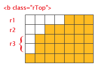
round-top diagram
"Magnified view" of the rows (r1 thru r3) that act as pixels. For larger corner radius, increase the numbers of the rows and modify the margins and height on each row.

HTML:
<div class="box">
  <b class="rTop">
    <b class="r1"></b> <b class="r2"></b> <b class="r3"></b> 
  </b>
    <p>content here</p>
  <b class="rBottom"> 
    <b class="r3"></b> <b class="r2"></b> <b class="r1"></b>
  </b>
</div>
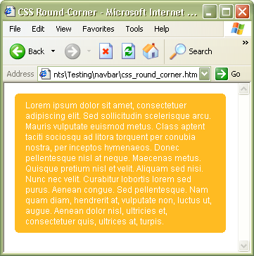
screen shot

Wednesday, October 04, 2006

Rounded Corners for Mozilla/Firefox

In Mozilla, -moz-border-radius can be used to give borders rounded corners. This is one of the proposals leading to the proposed CSS 3 border-radius property.

Syntax:
-moz-border-radius: <border-radius>{1,4} | inherit

Example
.box {
  background-color: #fb2;
  border: 1px solid #000;
  -moz-border-radius: 7px;
  -webkit-border-radius: 7px; /* for WebKit */
  padding: 15px;
}

Individual corners
The border-radius can be specified individually for each corner

  border-top-right-radius
  border-bottom-right-radius
  border-bottom-left-radius
  border-top-left-radius

http://developer.mozilla.org/en/docs/CSS:-moz-border-radius